How to choose quilt colors
Value, how light or dark a fabric is, does more for a quilt than color. A block in a light, a medium and a dark shows its design from across the room; the same block in three mediums turns to mush, whatever the colors.
By Editorial Staff
Value and contrast
The same Ohio Star block in two sets of fabric, and the same two blocks in black and white. On the left, a dark star, a light background and a red center: the star is clear in color and in gray. On the right, three fabrics of nearly the same value: in gray the star is much harder to see.
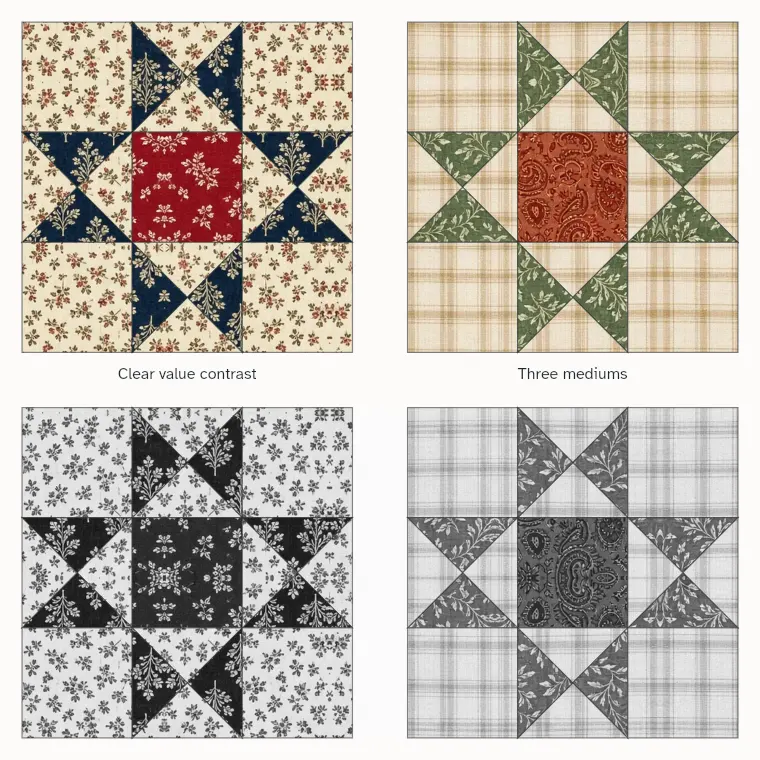
To check value, take a photo of your fabrics with your phone camera set to black and white, or squint at them. Sort them into light, medium and dark piles before you choose where each goes.
Color schemes
Four ways to put colors together, with fabrics from our swatches. One color in many values is calm and hard to get wrong. Neighbors on the color wheel feel warm or cool together. Opposites, like red and green or navy and gold, are lively. A neutral background with scraps of everything is the classic scrappy quilt.
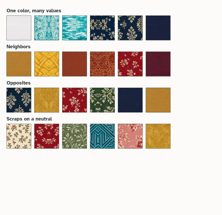
Start from one fabric you love, a large print with several colors in it, and pull the other fabrics from its colors. The Quiltspiration app draws any pattern in your own fabric so you can see the colors together before you cut.
Plan your next quilt in your own fabric
Quiltspiration draws any pattern in the fabric you own and works out the cut list for any size.